Titian and Venetian Colour Painting
Colorito in Venice: Use of Colour Pigments.
MAIN A-Z INDEX - A-Z of ART MOVEMENTS

|
Titian and Venetian Colour Painting
|
|
|
Titian and Venetian Colour Painting (1500-76)
|
|
COLOUR IN PAINTING WORLD'S FINEST ART
|
'Michelangelo for form and Titian for colour': this well-worn dichotomy, which originated in the cinquecento itself, has recently been thrown into disarray by the discovery, as a result of cleaning, of the brilliance and subtlety of colour in Michelangelo's Sistine Chapel frescoes; and no-one who saw the many-splendoured display of variegated colour in the early 16th-century Florentine High Renaissance paintings in the Medici exhibitions of 1980 could doubt the importance of colour, or at least of colours, to central Italian artists. If this exhibition were of Florentine rather than Venetian painting the colours would be brighter, more variegated in hue and altogether more dazzling than what we see before us. Why then the importance given, from Vasari onwards, to Venetian colour? In considering this question there are two difficulties. The first is an almost complete lack of information about what Venetian artists, and in particular Titian (c.1485/8-1576), actually thought about colour, if indeed they thought about it theoretically at all. From his writings it can be deduced that the Florentine Leon Battista Alberti (1404-72), the author of the major 15th-century treatise on painting (De Pittura), did not have a conception of colour as a constituent of visual experience which could be applied to what happened in Venice in the first three decades of the 16th-century. Venetian writers of the mid-century, like Pino and Dolce, were moving somewhat haphazardly towards an understanding of the role of colour in vision, based on their observations of how Venetian altarpieces and Venetian portrait painting was developing at that time. But even their thinking is very tentative and certainly does not constitute a coherent theory. See also the difference between disegno (Florentine approach) and colorito (Venetian approach). The second difficulty, which they did not face, is that the colour of Venetian paintings, which is more vulnerable than that of Florentine works because of the complexity of their paint structure, has often been radically changed and distorted by time. Colour pigments have deteriorated. Thus, the favourite Venetian green, for instance, a copper resinate, tends to turn brown or even black, thereby robbing paintings of a fundamental colour dimension. The process is, alas, irreversible, and in the beautifully cleaned St. John the Baptist (c.1540, Gallerie dell' Accademia, Venice) by Titian the marvellous blues are no longer matched, as they were intended to be, by an equal range and intensity of greens. |
|
|
|
|
Characteristics of Venetian Colour Painting With this in mind we can nonetheless discover in Venetian colour, as it developed in the hands of Titian in the first two decades of the sixteenth century, three main tendencies: firstly, a severe limitation in the actual number of hues, which very much contrasts with the emphasis on variety in Florentine High Renaissance painting; secondly, a tendency to choose the purest hues in their richest and most saturated state; thirdly, the intention to arrange them in overall harmonies that are simpler yet more sophisticated than the mere balancing of bright, contrasting colours that had gone before. These tendencies are remarkable in themselves, but they have their basis in a more fundamental change of which they are an expression. They depend on what amounts to a new mode of vision, which may be loosely described as 'perceptual' and still more loosely as 'realistic', a term applied by Titian and others of the Venetian Renaissance, who saw in his handling of light and colour a way of recording in paint a sense of living reality not achieved before. This new mode of vision is related to the theory of perception - going back to antiquity, but alien to Alberti and the Florentine Renaissance - which takes colours as the primary and essential constituents of visual experience and considers them - rather than outlines — as the primary building blocks in our conception of form. Whether or not this view was theoretically understood by Venetian artists at the beginning of the century, and most likely it was not, it is certain that in the work of Giovanni Bellini (1430-1516) from the 1490s onwards a change takes place that asserts this principle. The art historian Johannes Wilde compared the structure of Bellini's Baptism of 1500-01 in S. Corona, Vicenza, which is built up of patches of colour directly observed from nature, to that of a landscape painting by Paul Cezanne (1839-1903). This method, more boldly applied, is taken up by the early Titian and can be seen for example in Jacopo Pesaro Presented to St. Peter (1503-6, Royal Museum of Fine Arts, Antwerp). Other important works by Giovanni Bellini include: The Ecstasy of St. Francis (1480, Frick Collection, NYC), Doge Leonardo Loredan (1502, National Gallery, London) and The San Zaccaria Altarpiece (1505, Church of San Zaccaria, Venice).
Seeing the World in Terms of Colour Here the scene is built up without outline, in patches of colour, which stand for the form itself, its local colour and the modification of colour by light. So all the elements in the painting are integrated into a single system, in which the beauty of individual hues, so central to the tradition of Florentine art, is subordinated to an overall system of values drawn from the relationship of the colours to each other, and arising directly from the artist's perceptual experience of nature. It is the act of seeing the world in terms of colour that now forms the basis for painting; and it is because this aspect of visual experience is, by being translated into painting, here for the first time fully articulated, that the paintings convey to us, as they did to contemporaries, so intense a vibration of life. Titian in this very early work and, in a more developed way, in the paintings which follow it, was making discoveries about the role of colour in vision that added a new dimension to Renaissance art across Italy and beyond. Titian's System of Colour Painting But the system of colour which Titian evolved in the years between 1510 and 1520 owes its force and its subsequent influence not only to its direct relationship with visual experience, but also to his power of organising that experience in ways which were to become norms for the future of oil painting throughout Europe. The votive painting from Antwerp still includes a bright grass green and a soft warm brown, but the palette of what may be termed the 'classic paintings' of the next decade, Noli me Tangere (1511-12, National Gallery, London) for example, and the Assumption of the Virgin (Assunta) in the Frari, depends on the sonorous accord of only three main colours: red, blue and green. The combination of richness and intensity of hue which Titian achieves in the individual colours is made possible by his use of the oil medium, but his desire to present these primary hues at such a level of saturated intensity and his way of putting them together is a matter of aesthetics. Thus Titian limits his colours in order to bring them into a new kind of accord. 'The colourisation of which Titian was the originator', Theodore Hetzer wrote in German in 1935, 'is characterised by the fact that its fidelity to nature is bound up with an arrangement of colours which in its independent character displays the internal order of the world and its associations, relationships and connections'. We may not wish to express ourselves so metaphysically, but in practice our experience of the essential tightness of Titian's colour harmonies confirms what Hetzer says, and shows that Titian achieves through colour a harmonious but active balance of opposing forces in a manner strictly comparable to what Raphael (1483-1520) achieved through form. Moreover, in the attitude towards colour that the Renaissance inherited from antiquity and the Middle Ages there was material for a theoretical explanation of what Titian did. The idea that all colours may be calibrated on a scale between black and white and have, according to their mixture of hue and tone, relative weights comparable to tones in music, is found in Aristotle. It justifies the view, proposed incidentally with regard to Venetian painting by the English landscape painter John Constable (1776-1837), that the harmony of colours has an intellectual as well as a sensuous base. It is also worth noting that Aristotle in De Sensu, among several somewhat contradictory theories about colour, described the primary colours which complete what we call the colour circle as red, blue and green, regarding yellow not as a colour in itself but as a constituent of light, an idea not incompatible with Titian's practice between 1510 and 1520. In his paintings of this decade, yellow as a local hue seems to be largely excluded: it only re-emerges in the robe of St. Peter in the Pesaro Madonna in the Frari painted between 1519 and 1526. Strong as the yellows are, in, for example, the Assumption of the Virgin, they stand for light. |
|
|
|
|
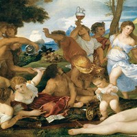
But Titian, whose style and practice always varied enormously according to the nature of the commission, could not long be limited by the classically pure formulae of his early years; and the introduction of further colour pigments and hues, especially the orange realgar and the yellow orpiment, which play such an important role in, for example, the Bacchus and Ariadne (1520-22 National Gallery, London) is, during the 1520s and 1530s, part of a decorative tendency natural to an artist brought up with the heritage of Byzantine art in the Pala d'Oro. Indeed, it is characteristic of Titian's approach to colour at this time that he handles pigments, especially the deeply saturated ultramarine of his skies and mountains, as precious materials in themselves, so that the colours in his court paintings, of which the Bacchus and Ariadne, painted for Alfonso d'Este, is an example, have the surface richness of an enamel. It was the special wizardry of Titian in these years to retain the individual brilliance of a hue and yet relate it tonally to the whole. Differently formulated, the same skilful balance is present in the work of another artist of Titian's generation, Lorenzo Lotto (1480-1556), whose greatness as a colourist is only now becoming properly appreciated. Habit and tradition lead us, wrongly I think, to regard Lotto as an eccentric artist. But his understanding of the interaction of colour and light is hardly less than that of Titian, and can lead to effects as visually sophisticated as the overall sense of marine atmosphere in the great St Christopher (1531, Gemaldegalerie, Berlin, Germany) and Madonna with St. Roch and St. Sebastian (1522, Contini Bonacossi Collection, Florence). Here the muffled pinks and mauves of the St. Roch are wonderfully related to the surrounding tones of aqueous grey-blue, and the scarlet and yellow of the St. Christopher provide a clarion call of explosive colour in the centre of the composition. Expression rather than decoration is always the driving force behind Lotto's colour, and this is again superbly shown in the Visitation. Here the hues are not decoratively balanced as they would be in works by Titian or Paolo Veronese, but create a tenderly moving contrast in the imbalance between the bright colours of the youthful Virgin and her attendants coming in from the right, and the muted violets and blues of the old people, Zacharias and St. Elizabeth, on the left. A transformation in the handling of colour, in particular, in its relation to tone, is one of the chief developments in Venetian painting in the 1540s, the decade in which not only the younger generation of artists, but also the middle-aged Titian responded to the new style of Mannerism in central Italian art. But whereas the new forms in Venetian art of the period can often be directly attributed to the influence of central Italy, this cannot be so with colour. What took place was a largely indigenous development which seems to have happened almost simultaneously among a number of younger and older artists. It can be studied in Andrea Schiavone's Adoration of the Magi (c.1542–46, Metropolitan Museum of Art, New York), probably datable to about 1547. Here the intensity of the individual hues is so muted that the drama and movement of the painting depends not on the colours themselves, but on the interplay of warm and cool tones to which the colours are subordinate, an interplay which, in Schiavone's fluent painterly style, weaves like a knot of writhing snakes over the whole surface of the painting. Of course not all painting of the 1540s and 1550s is so concerned with chiaroscuro, but what we find almost universally is a movement away from the pure, primary colours of the classic phase towards much more complex systems of harmonies and dissonances built from mixed hues. These are often highly individual in character, and usually emerge from a darkened background. In a way this development can be seen as a parallel in Venetian terms to the complexities of the mid-century Mannerist painting in central Italian art; a development which can be studied in the sharp, rather acidulated hues and silvery tonality adopted by Jacopo Bassano (1515-1592) at this period, and also in some of the works of Tintoretto. Tintoretto (1518-1594) is not a great colourist, although he often uses exciting, even bizarre, colours. But his approach to colour is indicative of a general tendency at this time, because he detaches it from the direct relation to visual experience which it had in the hands of Titian, and makes it one element in a bravura system of picture-making as varied and inventive as any in the history of art. Although in the deeply moving late Deposition silvery colour and fluent trails of paint are set against the circumambient darkness, they remain sharply separated from their surroundings, and their character is expressive rather than realistic: only very rarely in Tintoretto do we find that reality of space and air which is fundamental, as will be suggested in a moment, to the late work of Jacopo Bassano and Titian. Paolo Veronese's Method of Mixing and Combining Hues Paolo Veronese (1528-1588) also started from the principle of picture-making, but for him relationships of colour were, as they were not for Tintoretto, the fundamental constituent in his compositions. Although there is no evidence that he used any new pigments, Veronese's method of mixing and combining hues achieved a new level of decorative and expressive sophistication. But what is of particular interest here is the way in which in his late work he re-integrated this system of colour with a new understanding of chiaroscuro and related it more directly to visual experience. A superb example is the altarpiece from S. Pantalon in which the saint emerges from darkness into light, and all the colour values are related to the light and shade in such a way that they establish precisely the reality of the space in which the figures move. Veronese's painting was made in 1587, but this development had been anticipated by Jacopo Bassano and Titian. In the work of Bassano it can be illustrated by the altarpiece of St. Martin and the Beggar (1580, Sheldon Memorial Art Gallery and Sculpture Garden) or by the tiny Susanna and the Elders (1571, Musee des Beaux-Arts, Nimes). In the latter the distant buildings seem suspended in crepuscular twilight and in both the figures are evoked by what seem to be the final flashes of the dying light out of the thickening atmosphere. This vision is based on the artist's actual experience of the behaviour of colours in semi-darkness, and it is to this that the paintings owe their intensity and truth. See also Veronese's masterpieces Wedding Feast at Cana (1563, Louvre) and Feast in the House of Levi (1573, Venice Academy Gallery).
Titian's late style is evident in his extraordinary 'portrait of reds' - Portrait of Pope Paul III with His Grandsons (1546, Capodimonte Museum, Naples), but particularly in two late works in which light and colour seem to emerge only with difficulty out of the surrounding darkness, but from his struggle to describe this phenomenon as precisely as possible, a reality of space and air is established so certain that it is almost tangible. Colour plays a part, but it is handled in a different way in each of the paintings. In the Tarquin and Lucretia (1571, Fitzwilliam Museum, Cambridge), an easel painting, broken areas of local colour are retained as part of the painting's close claustrophobic focus; in the Flaying of Marsyas (1576, Kromweiz Archdiocesan Museum) it is not individual colours that tell, but an all-over emanation of broken touches, evoking a greenish-gold, that is spattered, appropriately to the theme, with reds like splotches of blood. Vision and expression are here so much one that they cannot, even for the purposes of discussion, be separated. But it can be said that in these paintings Titian's intense struggle to grasp in paint, through tone and colour, the physical realities of the scene is a fundamental part of their meaning.
REFERENCES |
|
• For the evolution of colour in painting,
see: History of Art Timeline.
ENCYCLOPEDIA OF ART HISTORY |